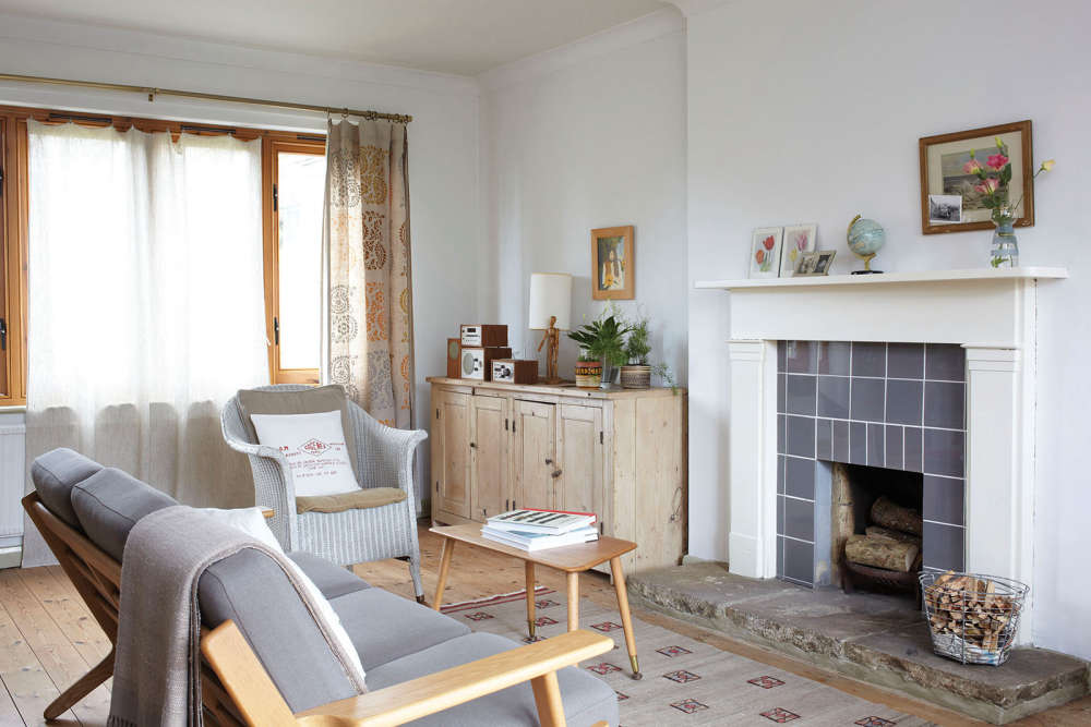
Joy and Steve Jolliffe work and play in their light-filled home, with its paired back Scandi style and fun pops of colour
When you’re running a business from home, workspace becomes a priority as it was for Joy and Steve Jolliffe when they were searching for a new place to live. “Space was our guide and we needed more of it,” said Joy, who creates screen and lino-printed textiles. “We needed a studio for me, and somewhere for Steve to work with his graphic designs.”
They found exactly what they were looking for on the outskirts of Ryde on their native Isle of Wight; a detached house with a huge, L-shaped ground-floor extension. “The previous owners had put two rooms on the side and wrapped it around the rear of the property so there was enough room to extend the kitchen, as well as have separate workspaces,” Joy explained.
They loved the house’s spacious feel, its proximity to the sea, and its generous, turned staircase, with wrought iron bannisters installed when it was built in the 1960s. However it needed a lot of work to make it feel like home.
“We got the impression that each house in this development had been built to a particular style and ours had been Tudor!” she said, citing the metal-studded front door and the ‘hideous’ former leaded windows as evidence. They were replaced, along with the internal doors, which, Joy said, made the interior ‘as dark as a dungeon’, swapping the solid wood for glazed panels. “Now the light fills the whole house; it’s made a massive difference.”
The house was decorated in a ‘peachy colour’ throughout, right down to the bathroom suite. “We arrived that first weekend and just ripped out
the old kitchen and the pink carpets that were everywhere,” Joy recalled. As they worked through the house Joy was thrilled to discover the original wooden floorboards. “You could still see the old pencil marks left on them by the joiners,” she said. “I haven’t cleaned off any of the scribbles because I love them.” The bare boards inspired the new look. “I love the simplicity and light of artists’ studios and wanted to create that feel,” Joy said. Rooms were painted white and the ‘monster’ brick fireplace in the sitting room was replaced with a white-painted Victorian surround.
Neither Joy nor Steve was afraid to adapt their favourite old pieces of furniture to suit their new home. Steve manfully hacked down an old coffee table to make the headboard for their bedroom and the kitchen dresser has been through a lot of identities. “It started off plain pine, then had patterns painted on it, we’ve constantly changed the colour and added the glass doors.” Now it’s painted white and holds cookery books and glassware.
Despite its pale, Scandi look, the house pops with colour provided by Steve’s graphic art and cushions designed by Joy. The kitchen is subtly coloured by a collection of enamel and the Wood’s Ware crockery in classic colours, which Joy displays on an old French bottle drier, next to the range.
More colour is layered by the couple’s treasured finds; they cannot resist ferreting around at auctions, charity shops and jumble sales. Their favorite bargain is the old wooden ladder now used as a towel-rack in the bathroom. “There was a pile of ladders at an outdoor auction which we bought for £10 and this one was underneath it,” Joy said. “Steve went to our amazing local ironmongers and found these perfect white brackets to secure it to the wall.”
Because of the nature of their working lives the house changes constantly – they are forever altering the display on their mantelpiece. “This is not a house that was specially created to be looked at because it has to serve a purpose for our work,” Joy said. “Our work is our life is our work.”
Photographer: Holly Jolliffe / Living4media
Words: Faith Eckersall / Living4media

 Schools Come Out In Force To Support "Wear What Makes You Happy" Fundraiser For Arlo Lambie
 Entertainment Guide: February 2025
 What to Watch in February 2025
 Island Update: January 2025
 Ryde Rotary Centenary: 100 Years Strong
 Home Style: Scandi Island Life
 What to Watch in January 2025
 Entertainment Guide: January 2025
 Memorial Held Following Death Of Kezi's Kindness Founder Nikki Flux-Edmonds
 Mountbatten Inviting Islanders To Sign Up For 2026 Lapland Husky Trail
 Home Style: Winter Wonderland
 Help Available For Islanders To Cut Energy Bills
 Island Update: December 2024
 New Home For Citizens Advice Isle Of Wight
 The Alternative Guide to Christmas Gifts
 Island Family Launches Appeal For Teenage Son With Brain Tumour
 What to Watch in December 2024
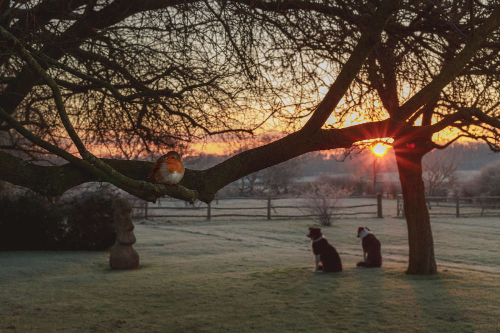 A Gardener’s Best Friend: The Story of Bob the Robin
 Memorial Quilt To Be Displayed On The Island
 Island Author Celebrating Amazon Number One